So, we’ve seen that digital creativity in the 1980s had a few avenues that could be explored: Logo let you draw to the screen programatically with the turtle, you could paint on the CRT with a light pen colouring pixels, you could create vector line art and then draw it on paper with a plotter, you could create portaits using an Amiga and a black and white video camera like Andy Warhol – but in the 1980s, could you actually then share your artwork digitally the way we do today?
These days we take the idea of graphical telecomputing for granted. The world-wide web allows us to share photos and artwork on social networks with relative ease, we can design sophisticated interactive web pages rich with graphical content. However, in the late 20th century information was usually distributed to people on paper, and what digital services there were delivered their data in simple plain text.
In the late 1960s researchers in several countries looked into ways in which data could be delivered to home users. There were two competing options: teletext, which was delivered over radio waves (typically as part of a television signal) and videotex, which was sent over the phone lines using a modem. Unlike teletext, videotex had the advantage of being two-way, allowing for true interactivity with the user.
In the UK, British Telecom (then the General Post Office) developed a videotex system known as Viewdata, which they launched as Prestel in 1979. During development it was agreed that both teletext services (such as the BBC’s Ceefax) and videotex services would use the same video standard of a 40×24 text mode with some graphics characters. This led to the teletext art we’ve covered in previous issues, which although interesting is quite limited in scope (so limited it’s amazing what people have been able to come up with!). A similar standard was used in France.
In Canada, however, researchers at the Communications Research Centre in Ottawa wanted something a bit more flexible, and so they devised a different standard, one that encoded graphics instructions as text, with each instruction represented by an ASCII character. Text was sent by bookending it with “shift in” and “shift out” characters. This protocol allowed for complex images to be transmitted in vector form and then reconstructed by the destination terminal (computer or set-top box). However, it also required more sophisticated computer hardware in order to decode the data, which meant terminals were more expensive then teletext-based terminals.
In 1978 a prototype system was demonstrated, and in 1979 planning for trials of the system, known as Telidon, began. It wasn’t long before American telecommunications company AT&T expressed an interest in the Telidon service. In the late 1970s it had experimented with the idea of a videotex service, and it was intrigued by the flexibility of the Telidon system. In the early 1980s it began adapting it for its own purposes, adding additional functionality and planning a rollout of a US-wide commercial videotex system.
In part due to AT&T’s involvement, videotex was soon speculated by many media outlets to imminently become popular and its use widespread by companies, educational organisations and the government. It was declared that videotex terminals would soon become as common as telephones. After all, the concept of digital real-time access to information and services was a novelty for most, and it seemed reasonable to assume that ability was something everyone would want.
Videotex was sure to be a hit.
Against that background, arts organisations began considering the artistic potential of the supposedly coming ‘videotex revolution’, and in 1981 the US National Endowment for the Arts funded an artists workshop, run by New York Univerty’s Alternate Media Centre, to explore videotex’s creative possibilities. They wanted to identify the stylistic capabilities and limitations of the Telidon system’s graphics protocol.
Artists would be invited to come and learn how to use the Telidon terminals, and then create artworks that would be included in content distributed over videotex systems in the United States and Canada. The workshop had three major goals: to allow time for artistic experimentation with the system, to engage a diversity of artists from different backgrounds and of differing levels of digital literacy, and to establish a framework for standardising graphical videotex content to ensure legibility and consistency of viewing across different videotex systems and terminals, taking into account the variety of content an artist could produce.
Ten artists were selected to take part in the workshop, nine of whom had no previous experience with computer graphics. Most of the participants were creating complex graphics after three or four sessions, although some were not capable of creating ‘production quality’ images until they had a few months of experience using the Telidon hardware.
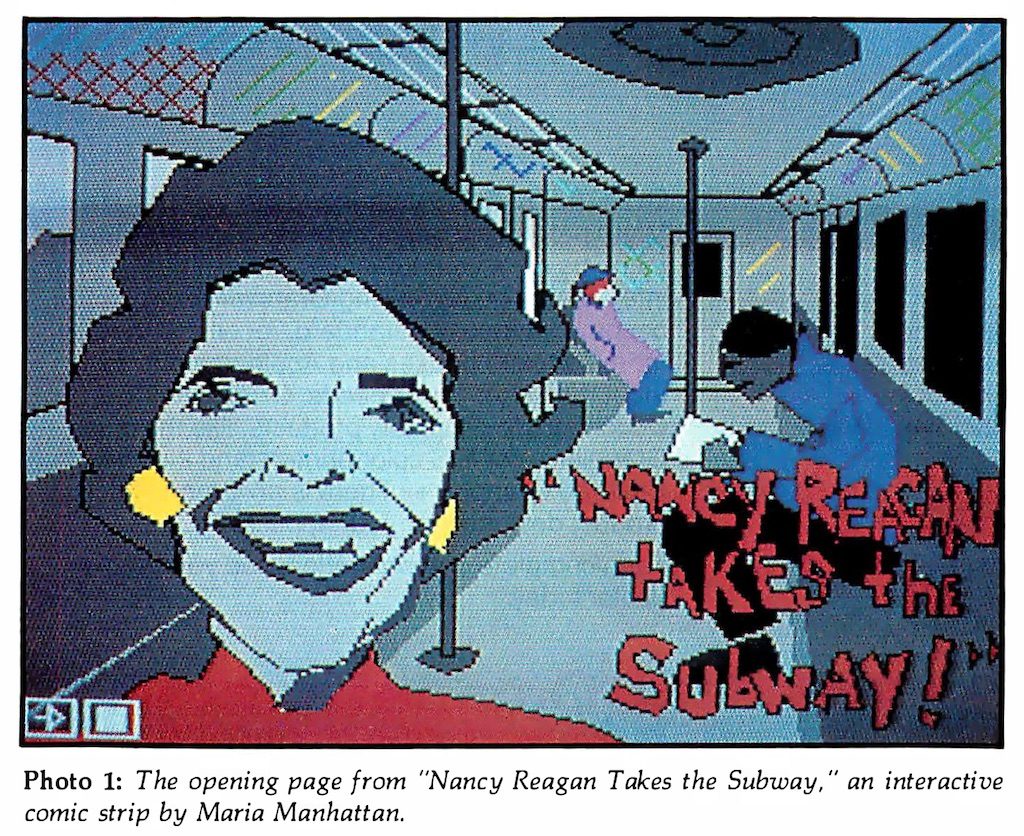
However, the artists weren’t just creating stand-alone images; they took advantage of the navigational capabilities of the Telidon system (a structure similar to modern-day web pages) to create not just sequential cartoons but semi-interactive presentations, for example one had the user moving from one room in a virtual house to another, and reading a short story in each. This was quite advanced for 1981, a time when doing something similar typically required programming a computer from scratch.
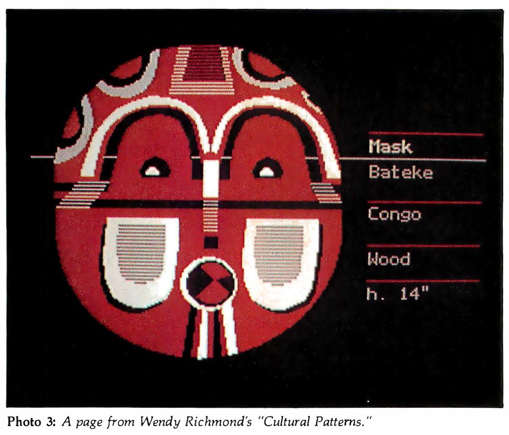
During the sessions a few things were learned. Artists found they were limited by the system’s palette of six colours and six shades of grey. However, they discovered they could work around that limitation by using dithering, where two colours are used in a checkerboard-like pattern to create the illusion of a third, or by halftoning, where differently-sized or spaced spots of colours create the impression of varying levels of darkness or lightness. But these methods also made the artworks more complex and data-heavy, and the slow transmission speeds of videotex (around 150 characters, or in the case of videotex, graphics instructions, per second) meant such images appeared very slowly. Consequently, it was decided these techniques would be used sparingly.
Simplicity was identified as a strategy fundamental to the effective design of videotex graphics: the ideal image could get both its artistic and conceptual messages across while keeping its overall data size low. For this reason, animation was experimented with but determined that attempts were largely distracting and cumbersome.
Legibility was identified as an issue in the use of text. The resolution of the videotex terminals was not high, and would often be displayed on television sets using RF (radio frequency) modulators, which made the presentation of large amounts of text somewhat challenging. Short sentences and paragraphs, displayed in large type, were best.
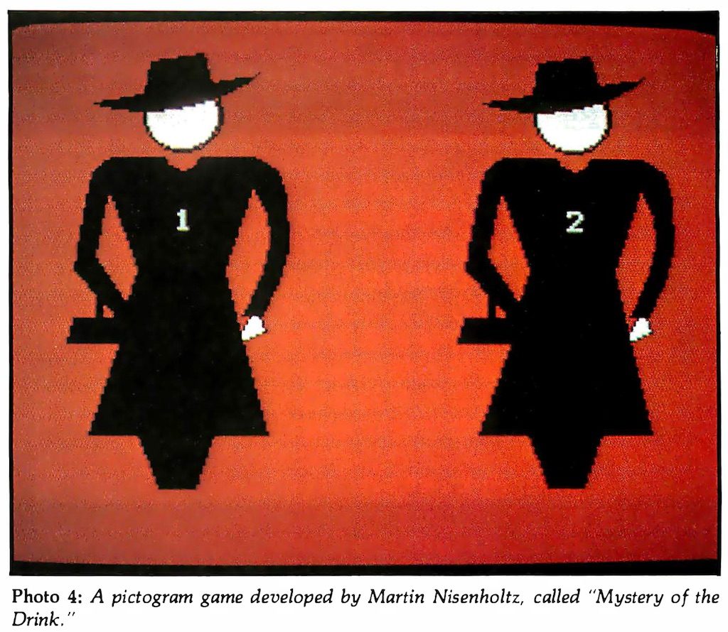
Various visual cues to help users navigate presentations were experimented with, and in some cases became part of the uniqueness of each. In one case, the navigation itself became a game, where users had to decipher the meaning of symbols in order to navigate through it.
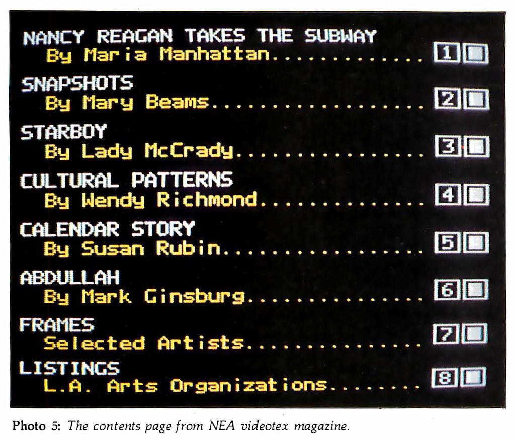
The end result of the workshop was an electronic magazine with 425 pages containing works by the ten artists, and index pages. It was presented on videotex systems in New York and Saskatchewan, and shown at video festivals in Los Angeles and Washington DC.
The workshop’s organisers concluded that, while it had technical limitations, the videotex system had potential as an outlet for creative expression, more so than teletext. Additionally, they speculated regarding the potential for the system to facilitate communication between artists (for collaboration and critique) and with consumers of their art, to perhaps drive artistic creation or enable sales or promotion – and they were correct, these are all common uses of today’s Internet. Videotex’s future looked bright.
So what happened? Why didn’t videotex take off?
Firstly, the terminals were expensive. In order to display vector-based graphics they needed (for the time) near state-of-the-art micro-computing hardware. Secondly, home computers were becoming a thing, and they weren’t much more expensive. When faced with the choice between the two, consumers opted for the computers, even though the only communication services you could connect to with them were strictly text. Videotex software was produced for some home computers, but many videotex providers sent information over cablevision systems, meaning the purchase of additional hardware to receive it. Videotex was also typically slow, and many users were impatient. Despite several efforts at creating a commercially viable videotex system, they had largely died out by the mid-1980s…
…with one notable exception. Prodigy was an online service launched in 1984 that used the Telidon’s communication protocol (known as NAPLPS, the North American Presentation Layer Protocol Syntax) to provide a graphical experience to its users. Unlike other videotex services, Prodigy worked strictly using home-computer software and standard telephone modems, so the up-front costs to the consumer were lower.
In order to solve the speed issue, many of the common graphics and user interface elements were bundled into the Prodigy software, lessening transactions between the server and the client. The software had an internal programming language interpreter that could execute software sent by the server on the local machine, and also appears to have cached data to additionally speed up loading times.
All of these elements combined to mitigate the deficiencies of earlier videotex attempts, and Prodigy was successful, offering its videotex-based service until 1999, when it was forced to close due to it not being Y2K compliant. But by then there was the Internet, and HTML.


Be the first to comment